A lower mortality rate: fact or artifact?
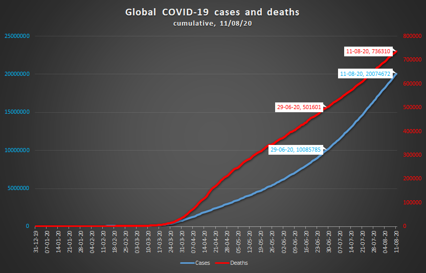
On June 29, the pandemic hit two milestones in one go: 10,000,000 infections and 500,000 deaths. Just 43 days later, on August 11, the number of infections had also passed the 20 million mark. But while the positive cases had doubled, the death toll had only risen by 47%. Are we really looking at a decreased mortality rate? Could this be a bit of a bright spot in the crisis?

The first thing coming to mind is that this is an artifact rather than a true trend. More tests could explain the seemingly lower mortality rate. Probably testing volumes have increased much more than the number of cases. The number of tests needed for one case will hence have gone up. Expressed differently, the positivity rate (% of tests that confirms contagion with the virus) has decreased. As so many cases are being detected which previously would have gone unnoticed, the mortality rate goes down. It starts to approach its actual value.
This sounds plausible enough, but is it true? Our World in Data collects testing numbers of 86 countries. These 86 countries make up 62% of the world’s population. On June 29, they accounted for 78.9% of all known cases; on August 11 for 77.5%. Surprisingly, however, the increase of the number of tests has not kept up with the rising number of cases: 83% versus 96%. In other words: the overall global positivity rate has increased, not decreased.
Of course this rate lumps together countries with very different testing strategies and performances. Elsewhere, we have looked in greater detail at testing of individual countries. In particular, Latin American countries show abysmal figures, with positivity rates exceeding 40% (Bolivia, Ecuador, Mexico). Peru even manages to report more cases than tests. It turns out a patient tested positive via PCR (virus) tests and via serology (antibodies) tests counts for 2 cases in the country’s report.

So: no, we may not conclude that the faster increase of cases compared to deaths is due to increased testing. Now it could be, theoretically, that the number of deaths is even more under-reported than the number of infections. However, this looks unlikely, and why would this phenomenon all of a sudden become so dominant in this particular time span of 43 days? Let’s move therefore to hypotheses which can explain a truly decreasing mortality rate.
Age comes to mind. Back in March, Europe was the center of the outbreak. Primarily the elderly were hard hit. However, the latest wave of infections in Europe touches in particular young people. In Belgium, Germany, The Netherlands and Spain, the age group of 20 to 39-year-olds now accounts for 37 to 41% of all new cases. In France, the incidence rate among 80- to 89-year-olds has halved, while the same rate in the 20 to 39 age group has gone up by a factor 4 to 5.
Moreover, the epicenter of the pandemic has meanwhile shifted elsewhere, particularly to Latin America, and generally to places with a much younger population than Europe.
Perhaps the global hunt for a vaccine has also blinded us for the progress already achieved. Eight months since the onset, we can battle the outbreak more effectively. Medical responses are faster, treatments are better. Most of all, contact tracing slowly gains ground and helps to save lives.
The New York Times described the peculiar example of the White Mountain Apache tribe in Eastern Arizona. The Apaches, as so many minorities living in too small places with too many people, belong to the hardest-hit communities. The corona incidence rate is 10 times higher than the average rate in the state of Arizona. However, the death rate compares favorably: 1.3% as opposed to the state average of 2.1%. The tightly knit community has been followed closely by a contact-tracing team of 30 members. Key to their approach turns out to be a very simple device: a pulse oximeter. An oximeter measures blood oxygen levels and detects infected people at an earlier stage in the disease.
Finally, an intriguing explanation is offered by the mutation of the SARS-CoV-2 virus. A mutation which has drawn much attention concerns the change of the spike protein, the protein on the surface that attaches to the human cell. The original D614-version (D denoting aspartic acid) has changed into the G614-version (G for glycine). The G614 is now prevalent in most of the virus’ variants found all over the world.
Is the G614-version more contagious, perhaps less lethal? Some recent publications (Korber et al., Danilosky et al. on viral loads, Weissman et al. on disease severity) point in that direction.
In the end, we might be truly witnessing a decreasing mortality rate. That would be a ray of well-needed sunlight, breaking through dark numbers. But yes, we should still test much more.
Sources data
on COVID-19 cases and deaths per country: European Centre for Disease Prevention and Control
on COVID-19 tests per country: Our World in Data
(rvdk)


Pingback: A closer look at the numbers (07/09/20) - The Corona Diaries
Pingback: A closer look at the numbers (07/10/20) - The Corona Diaries