
A closer look at the numbers (07/09/20)
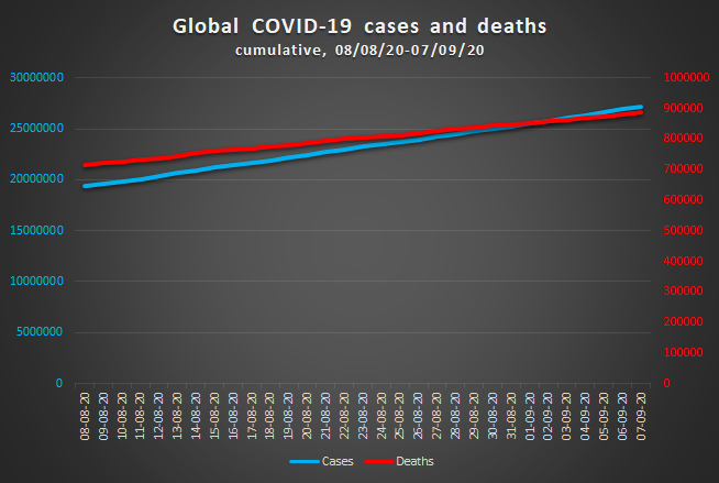
When trying to spot a trend in his experimental data sets, rarely a researcher will find a near-perfect linear fit. He will find it hence hard to believe that the damage of the treacherous coronavirus with time will follow such a straight line. And yet, it is so. Between August 8 and September 7, the number of deaths and cases have progressed in almost linear fashion, as they did in the previous 30-day-period.
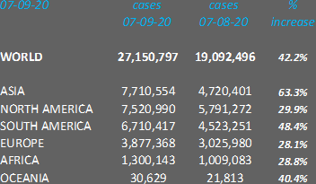
The number of daily deaths averaged again 5700. The number of cases grew each day by around 259,000 (248,000 between July 9 and August 7). As the graph clearly shows, the slope of the infections’ curve is steeper than the one for fatalities (increases since 08/08/20: 42% and 25%, respectively). Once more this points towards a decreasing fatality rate. A lower mortality rate: fact or artifact discusses several factors that could explain this observation.
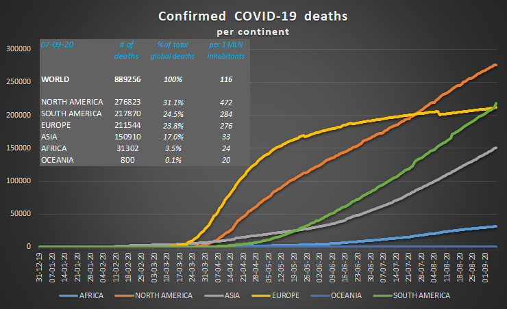
The shapes of the individual curves of the continents show the different dynamics of the pandemic on each continent. The pandemic has cost most lives in North America. South America has meanwhile overtaken Europe. Partly this is due to a correction by the United Kingdom. A different attribution of death causes has lowered the UK’s fatalities per August 7 by almost 5,000 (reflected in the odd dip of the European curve).
All in all, Europe and the Americas account for more than 3/4 of all corona deaths, with less than 1/4 of the world’s population.
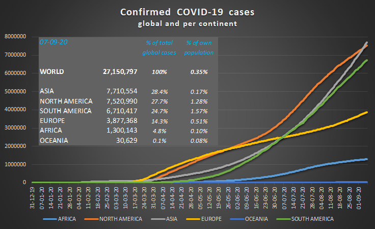
Asia has passed North America for most corona cases. India, with 2,177,539 new infections, is responsible for 73% of the continent’s increase. Corrected for its enormous population, the picture is more nuanced, however. On September 7, India had officially 42.7 weekly new infections per 100,000 inhabitants. This is less than France (69.9) and Spain (127.2). It is also less than two very worrying hot spots in Asia: Israel (195.1) and Palestine (99.4).
Next to Asia (+63%), also South America (+48%) and Oceania (+40%) have experienced a strong rise in new infections since August 8. The European curve shows an inflection point early August. This is testimony to the rising numbers in many European countries, or the so-called ‘second wave’.
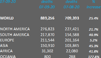
The overall trend of an apparent mortality rate going down is confirmed for North and South America, Europe and Asia. For these continents, the number of infections increases faster than the number of deaths. In Europe, this is even very marked: 28% more cases go along with 5% more deaths.
However, we do see the opposite for Africa and Oceania. The rise of infections does not keep up with the increasing death toll. A possible explanation is that both continents are in an earlier stage of the pandemic. One can hypothesize that in the early phases of the pandemic more people, more vulnerable people die.
All in all, the current figures do not confirm the cautious optimism expressed by the WHO late August. For this, we would need to see less than 5700 daily deaths or 259,000 cases a day in a month from now.
Sources:
Data: European Centre for Disease Prevention and Control
Title image: Khosro via Shutterstock
(rvdk)

Pingback: The perils of predicting death. Reflecting on 1,000,000 and 2,000,000 - The Corona Diaries
Pingback: A closer look at the numbers (07/10/20) - The Corona Diaries