
A closer look at the numbers (07/10/20)
One month ago, Israel was one of the worst corona hotspots in the world. It still is. Within a month, the incidence has gone up from 195 to 339 new weekly infections per 100,000 inhabitants. But several other countries now show similarly worrying numbers as Israel did one month ago: Montenegro (291), the Czech Republic (198), Belgium (177), France (165), and Argentina (164).
The threshold for what we consider hotspots is moving up. We seem to become increasingly immune for high incidence numbers. 300 is the new 200, so to speak. This illustrates, better than anything else, the fast pace at which new COVID-19 infections appear.
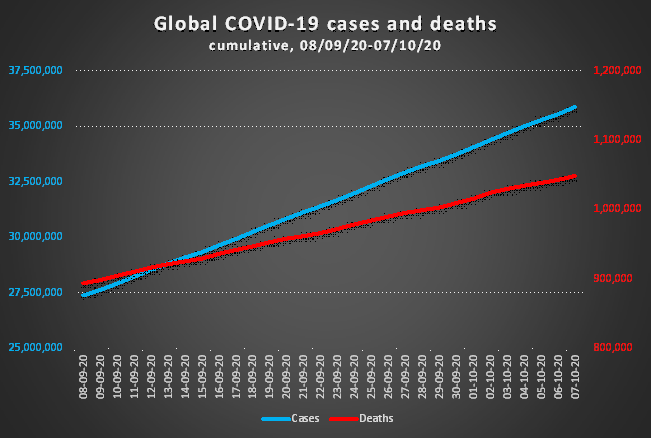
By now, 0.5% of the world population has been infected. The true numbers might be 10 times higher, or even 20 times, as the World Health Organization has stated on October 5.
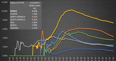
Since September 7 the number of cases has again increased more than the number of deaths: 32% versus 18%, respectively. This further confirms the trend seen in the last months. Also, this raises again the hypothesis of a decreasing mortality rate, earlier discussed in A lower mortality rate: fact or artifact?
The difference here has become only more pronounced last month. Part of that is finally some good news. While the average number of new infections has climbed by nearly to 10% to 290,000 per day, the daily death toll decreased to 5300, down from 5700. With one curve bending upward, the other one downward, the odd linearity we observed during a couple of months gets lost.
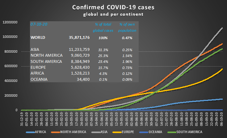
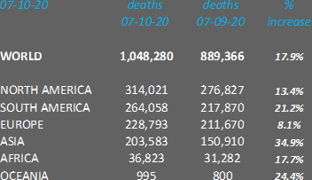
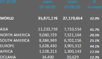
Looking at the data per continent and corrected for population size, Europe, North and South America have a 10 to 20 times higher death toll than the other three continents. Based on the official numbers, South America has today the largest incidence: 2% of its population has been infected. As testing here is notoriously inadequate, South America seems today the continent hardest hit by the pandemic.
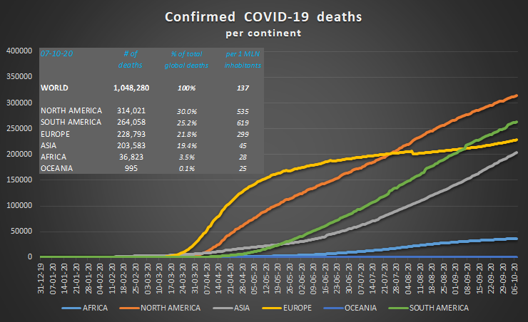
Both death toll (since 07/09/20: 53,000 deaths, +35%) and positive cases (+46%) have risen sharply for Asia. India accounts in this period for 2,5 million out of the 3,5 million new cases (72%), and for 33,000 deaths, or 62%.
Last time we observed a worrying trend for Africa. Its death toll was rising faster than the number of positive cases. This seems to have stopped now. Both parameters show similar growth percentages. As a whole, the African curve of new infections seems to flatten, which is additional good news.
Early August, the European curve of COVID-19 infections showed an inflection point, indicative of the start of the “second wave”. Meanwhile, the second wave is steaming ahead. Over the past 30 days, the Old Continent has seen 1.7 million new cases, a rise of 44%. The increase of the death toll in the same period by 8% seems in this respect reassuring. This is, however, treacherous. Initially, primarily young people (age group 20-30) have been infected. Only now, the virus is diffusing its way throughout all age groups. On top of that, death trails infection by a few weeks.
With the Northern Hemisphere now entering the cold season, it is to be seen whether the reduction of the global death toll will continue. In any case Europe is up for some dark months.
Sources:
Data: European Centre for Disease Prevention and Control
Title image: Khosro via Shutterstock
(rvdk)

Pingback: A closer look at the numbers (07/11/20) - The Corona Diaries