Odd ratios. Why Europe stands out, and why this is not good news
One day, the virus will lose its power to infect people. The pandemic will be over. There will be no more new cases, but the death toll will still continue to rise for some time. Some people already infected will lose their last battle, weeks, perhaps months after the war was officially declared over.
Let’s imagine a world in which 100% of all cases and all deaths are being reported. Does this mean the mortality rate, the percentage of deaths of all infections, will steadily increase from the start of the outbreak?
Not necessarily. One could imagine weaker people in a population dying at an early stage of the pandemic, with less vulnerable people becoming infected later, and surviving. Except for that last part of a pandemic, where mortality will inevitably rise.
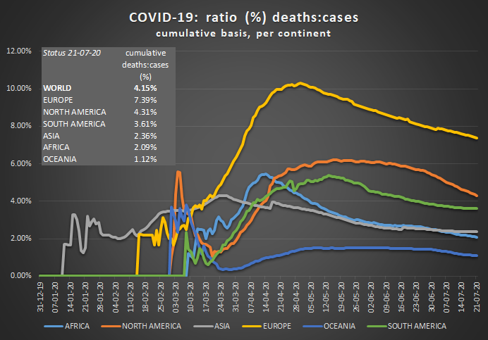
In our far from perfect world, where it became only too painfully clear that testing capabilities were insufficient, trends might be difficult to discern. When looking at a graph of deaths over cases with time for the various continents, one thing is striking, however. Although the ratio seems to drop for all continents, pointing at the age mechanism just described, combined with increased testing, one continent clearly stands out: Europe.
Europe’s ratio at 7.4% is almost twice as high as the second continent, North America. Is it because of Europe’s old population and its incapability of dealing with the outbreak in nursing homes? Do all other continents underestimate their deaths? Or does Europe not test enough? Something to keep an eye on.
(rvdk)